Differential Gene Expression (DGE)
DGE analysis identifies genes with statistically significant expression changes between biological conditions.
Gene Concordance Score (GCS)
To validate the performance of synthetic data in preserving differential expression signals, we developed metric called Gene Concordance Score (GCS). This metric provides a single integrated measure that quantifies the weighted proportion of synthetic genes concordant with the original data across two key dimensions: regulation direction (up- or down-regulation) and level of statistical significance. Higher GCS values indicate a larger proportion of synthetic genes that faithfully preserve both the directionality and the degree of statistical significance observed in the original pathways.
Step 1: Rank Score Calculation
Each gene \(i\) is assigned a rank score combining effect size and significance:
Step 2: Concordance Zone Identification
A significance boundary is defined at \(s_{\text{thr}} = -\log_{10}(0.05)\). Four concordance zones are defined in the \(\text{RS}_\text{original}\) vs \(\text{RS}_\text{synthetic}\) plane:
- Significant zones (zones 3 & 4): Genes significant in the same direction in both datasets → count \(N_\text{sig}\)
- Non-significant zones (zones 1 & 2): Genes non-significant but directionally concordant → count \(N_\text{non-sig}\)
Step 3: GCS Calculation
where \(\omega = 0.5\) assigns lower weight to non-significant genes, prioritizing biologically meaningful signals.
Code Example
The GCSAnalyzer class provides the full workflow for computing GCS and generating scatter plots:
from synomicsbench.metrics.narrow_utility.DGE import GCSAnalyzer

original_dge = pd.read_csv('original_dge_path.csv')
synthetic_dge =  pd.read_csv('synthetic_dge_path.csv')
# Initialize with column mappings
analyzer = GCSAnalyzer(
    term_col="Gene",
    nes_col="Log2FC",
    q_col="Q_value",
    q_thr=0.05,
    w=0.5
)

# Process a single synthetic dataset
(rankscore_or, rankscore_syn, gcs, n1, n2, n3, n4, m, ori_size, aligned_size, seed) = \
    analyzer.process_single_dge_result(original_dge, synthetic_dge)

print(f"GCS: {gcs:.3f}")
print(f"Significant concordant genes: {n3 + n4}")
Scatter Plot Visualization
The scatter plot shows the rank score comparison between original and synthetic data, with concordance zones color-coded. The following code produces manuscript-quality GCS scatter plots using the Melanoma cohort as an example:
from synomicsbench.metrics.narrow_utility.DGE import GCSAnalyzer

analyzer = GCSAnalyzer(
    term_col="Gene",
    nes_col="Log2FC",
    q_col="Q_value",
    q_thr=0.05,
    w=0.5
)

# Map method names to synthetic DGE result CSV paths
dataset_dict = {
    "Avatars K5": "DGE/avatarsk5_0.csv",
    "Avatars K10": "DGE/avatarsk10_0.csv",
    "CTGAN": "DGE/ctgan_0.csv",
    "Gaussian Copula": "DGE/gaussiancopula_0.csv",
    "Synthpop": "DGE/synthpop_0.csv",
    "TVAE": "DGE/tvae_0.csv",
}

# Plot all methods in a grid
fig, gcs_dict = analyzer.plot_gcs_datasets(
    ori_data="DGE/origin.csv",
    dataset_dict=dataset_dict,
    figsize=(18, 10)
)
fig.savefig("dge_gcs_scatter.png", dpi=300, bbox_inches="tight")
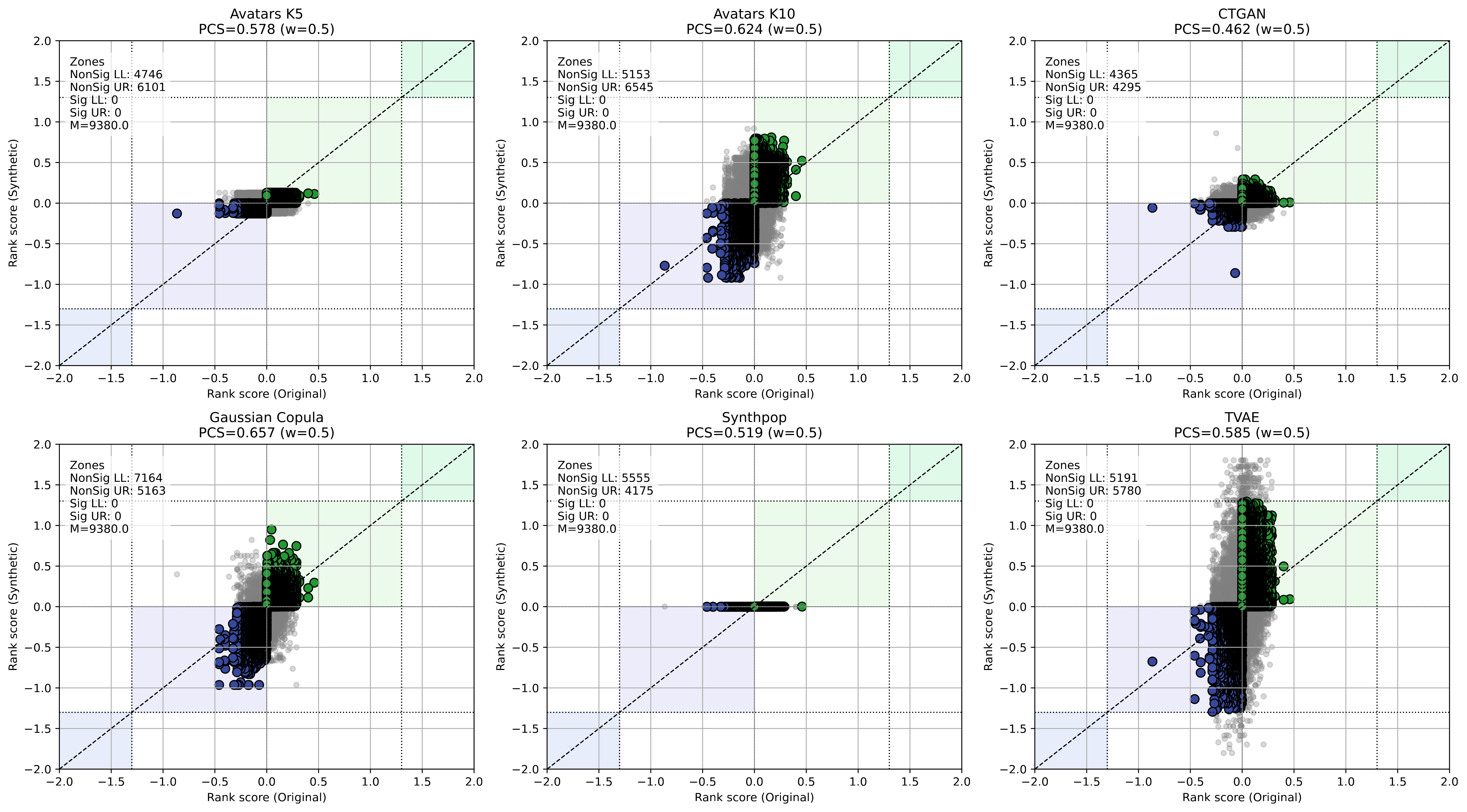
Scatter plots of gene rank scores (Original vs. Synthetic) for each SDG method in the Melanoma cohort. Points in colored zones indicate concordant genes; the GCS value is shown in each panel.